Python matplotlib绘图时x轴标签重叠覆盖
当标签文本很长时,或者是某维度的数据列表长度很长时,都会造成标签的重叠覆盖。
解决方法有以下几种。我们使用的数据如下:
1 | import pandas as pd |
拉长画布
查看画布默认大小
1 | plt.rcParams['figure.figsize'] |
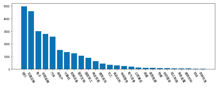
我们把画布拉长一倍,设置 figsize 参数。
1 | fig, axs = plt.subplots(figsize=(12, 4)) |
拉长以后,bar 的宽度也变大了。
由于 x 轴的数据太多了,还是有覆盖现象。
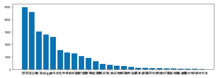
调整标签字体字号
1 | fig, axs = plt.subplots() |
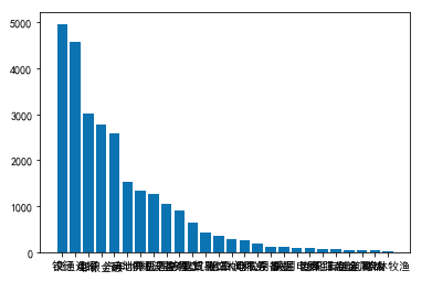
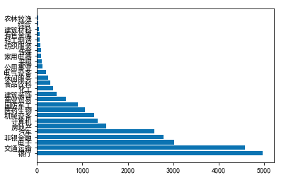
x轴和y轴互换
1 | fig, axs = plt.subplots() |
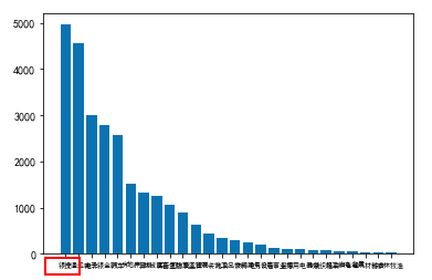
标签旋转
目前比较好的解决方案可能是标签旋转,再适当的放大x轴。
1 | fig, axs = plt.subplots(figsize=(12, 4)) |